Wednesday, September 30, 2009

Nikki S. Lee

        I apologize for missing a day, it somehow entirely escaped me...

        I was looking through the bargain books at Newbury Comics last week, and I saw Nikki S. Lee's Parts and greatly contemplating buying it (I may have to go back). However, being reminded of her work got me thinking once again about the roles photography can take on for different artists (a discussion I opened in my recent post on Michael Collins). Though they both create beautiful images, Lee is on a different end of the spectrum than Collins in terms of intent and use of photography.
        Lee's work (the most well known being Projects ('97-'01) and Parts ('02-'05)) explores the notions of identity. In Projects Lee takes on a variety of different personalities representative of stereotypical cultural and ethnic groups (including "hip-hop" and "senior", which I have shown, as well as "yuppie", "punk", "lesbian", "ohio" and many more), by infiltrating the intended group using clothes, hair, fake tans, a fake name, dance lessons, what have you. She then has someone else (typically a member of said group) take her picture, in typical snapshot fashion (you can even see time stamps on the pictures). In 2001 the NY Times smartly described her photographs as looking like "a collaboration between Cindy Sherman and Nan Goldin" (if you don't know who both those photographers are you should look them up, they're important).
        In her second major work, Parts, Nikki appears again, shot by an outside figure, with supposed romantic interests, on what appear to be dates. The most interesting thing however, is that the men have been cut from the images (as shown by missing pieces of a border suggestive of convenience store printing; a brilliant touch), leaving nothing but traces -a hand, the top of a head- that the men had been in the photo at all. The pictures could be real, every girl has some picture of her and a guy who she'd like to cut out. The series continues Lee's exploration of identity, asking how we form our sense of identity based on people present (or absent) in our lives, particularly ones we are romantically connected to.
        Lee's more recent work continues to explore issues of identity, such as in Layers ('07) where she travelled to different countries and had people sketch her, then layered and photographed the sketches together using lightboxes, creating an interesting conversation about the way people from different cultures represent her Korean features - the sketches never end up looking like Nikki. All her works are very interesting, yet maintain a level of visual interestingness and beauty.
        To quickly wrap this up and bring it back to where I started, I just like to appreciate the contrast in the way Collins and Nikki use photography extremely effectively to accomplish two different means (and with two very different yet equally interesting and beautiful products). In thinking about Nikki's work, it must be considered that she is not taking the photographs herself, and what the performative aspect that is so heavily present means in relation to the still image products (all this opposed to Collins' belief in straight image-making). I believe that much of their effectiveness as photographers lies in their belief in the power of the form of photography to which they ascribe.

Sikkema Jenkins & Co. (gallery that represents Nikki)
Leslie Tonkonow gallery (good base selection of images)
Shopping With - Nikki S. Lee; Dressing the Part Is Her Art (good NY Times article from 2001 about Projects)
Now In Moving Pictures: The Multitudes of Nikki S. Lee (good NY Times article from 2006 about Lee's video work)
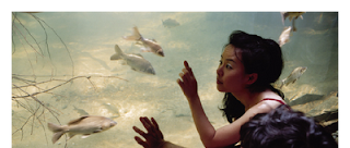
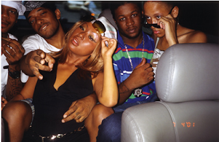
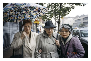

images: various sources, c. Nikki S. Lee

Monday, September 28, 2009

aaliyeh


        Quick break from the really long posts I've been writing lately!
        I was clicking through the flickr "Last 7 Days Interesting" page a few weeks ago and came across this image. I want to be in this space!! I'm not usually into photographs of projections, but it just comes together so well (I love how the projection just hits the ends of her fingers). The flickr user, "aaliyeh"'s account is here (only 4 pictures, but this one is just fabulous so I had to share it).

image: flickr.com/photos/sometimesaaliyeh/

Friday, September 25, 2009

Michael Collins


        Yesterday I attended an extremely refreshing lecture by Michael Collins about his work. Coming in knowing only that he was a cityscape photographer, I was really (positively) surprised at how much I liked his work. He opened the lecture with a slide of a black and white photograph of a young girl, taken by a photographer who was part of a small town where everyone knew each other. He spoke about how the photograph is genuine and intimate, and the difference in the way we view photographs that have been taken by professionals and photographs that are dear to us that may have just been snapshots. He mentioned that the girl wanted her photograph taken because he grandfather was going blind, and she wanted him to always have a picture of her, a flawed and yet "perfect" way of thinking, because as he says a photograph does just this, captures an image forever. He continued (before opening up into his own images) by presenting a range of archive photographs of industrialization in England (which have deeply inspired his work), and talked about the way that they were intended to describe, not analyze or make any sort of point ("describe vs. explain" as he repeatedly put it). It was this discussion of how he believes photography is being taught all wrong, and that the way we intellectualize photography strips it of what at its core it actually is.
        The way one views photography as functioning is obviously very individual, and I have agreements as well as disagreements with Collins' definition, but it was the fact that it is so vastly different from the way photography (and art in general) has always been taught to me that made Collins so interesting and engaging to me. The fact that art is at its core entirely visual, and that meaning and intellectualization is applied is entirely ignored in art school (at least that way that it has been presented to me). Everything has to have a meaning behind it or you're just being frivolous. But Collins points out that that's what art is. He is unapologetic, and takes photos to capture spaces that he believes are beautiful, in the most honest way that he can.
        It is largely Collins' stronghold to his belief in the function of photography that makes his images so strong. He is wildly dedicated to his images, once he has found a space that he believes needs to be captured his is unrelenting in capturing it and capturing it truthfully. He will return to a location again and again, despite whatever odd looks or questions he may receive, and defend the importance to him of this single image. He also stated that he approaches image-making in a "childlike" way, finding spaced that he finds especially arresting and then giving them sort of a wave when he has (hopefully successfully) completed his image, which really shows Collins' respect and connection to the places he chooses to photograph.
        I have mentioned a few times now that representing the spaces faithfully is of extreme importance to Collins, and this is because he strives to show the spaces evenly and exactly as they really are, and not to exaggerate or glorify them in any way. In achieving this Collins' always photographs in very even (overcast) light, so that there are no shadows, which he said "hide detail", so Collins' images effective lay everything on the table. Adding to this sense of "realness", I believe, is that Collins is photographing industrialized spaces, which he notes, have been designed by engineers, not architects.
        It was just extremely energizing to listen to someone who cares so deeply about photography as a visual form. If anyone ever has the chance to listen to him speak I would highly recommend it, and if you are in the NYC area his recent work of London (where he lives) cityscapes is currently on view at the Janet Borden, Inc. gallery (through October 17th). His photographs are very large, and he mentioned multiple times that he pays extreme attention to getting every detail in focus, so I'm sure they are really something to see in person. And I would seriously, seriously say, ESPECIALLY if you don't typically like landscape/cityscape photography, to look at his website. Expand the images so that they are full size, and look at them all. Collins has an astounding eye, and his passion for what he does comes through in every photograph. You won't regret it.

Record Pictures - Photography by Michael Collins (his website)
Janet Borden, Inc. website


images: recordpictures.com

Thursday, September 24, 2009

Wolfgang & Christoph Lauenstein, and Tarsem Singh


        Since I mentioned The Fall in my last post, I felt it was an appropriate lead in to twin German animating/producing duo Wolfgang and Christoph Lauenstein, who animated a short sequence in the film. I feel conflicted about talking about this sequence, because it is really important that it be seen as it was intended (within the film), but in talking about the Lauensteins and animation in general it is a very important piece.

        To first quickly talk about The Fall (I'll try not to go on and on though I could); every image has been carefully crafted and beautifully executed, and from what I can understand much of this is credited to the director Tarsem Singh, who was fully dedicated to the film. There is never anything in the frame that was not intended to be in the frame, and everything within the frame is symbolic or integral to the film as a whole. No matter how many times I watch it I am always noticing new things and in constant awe of the raw beauty in the story and the way it has been executed.
        The acting is extremely real, partially because they are very talented and partially because one of the two main characters is played by a six year old girl, and this in many ways informed and changed the actual story (a mistake she makes is written into the script, filming in a hospital is done through holes in the bed-curtains so the intimate environment shared between her and the other main character is truthful, she was only allowed to see certain characters as they appear in the film, etc).

        Everything really comes together, and this in combination with the story make it extremely easy to become emotionally involved. There is a great deal of pain in the film, as well as discussion around the constructions of and ways of dealing with pain. The Lauensteins animated scene comes in at a very important turning point/climax in the film, and the sudden change in media (live-action to stop-motion) is EXTREMELY jarring (as it is intended to be).
        You can watch the scene without "ruining the ending" in any way, or anything like that (I promise), but what you will be losing is contextualization. Contextualization in terms of the way that every object in the sequence is significant, but also contextualization in the way that you will be missing the entire nature of why having this scene in stop-motion is so effective. So really I urge you to just watch the whole movie and look out for it. But if you want to just watch the scene (or have already seen the whole film) you can watch it here. It is the main character, Alexandria's construction of her surgery after falling and hitting her head. The sequence moves seamlessly back into live-action with direct relationship between the fluttering of butterfly wings and Alexandria's eyes blinking rapidly awake.
        The scene is, in the context of the film (and probably without it as well), pretty disturbing, which is to say that the Lauensteins have been extremely effective in creating a scene that both represents the way Alexandria would interpret the events as well as transferring the anxiety she would have felt to the viewer. This was a sort of revelatory moment for me, because though I have seen films with a mix of live-action and stop-motion (Jan Svankmajer's work for example) -it was usually used to briefly animate things that could not otherwise be moving about on their own in the environment of the live-action, and would happen throughout the film. Having just this one scene fully animated, and as a way to show a different perspective, especially that of a child, is just so perfect and so effective in relationship to the rest of the film that it really seemed to place animation on a different plane for me.

        It is also impressive stylistically and technically. The Lauensteins have a very distinctive style, which combines claymation, puppet animation, and computer animation, and the figures seen in The Fall are deeply reminiscent of the figures in their claymation short Balance from 1989, which have appeared in other (mainly advertising) work by the two since then as well. The scene in The Fall is a pretty big departure from their work thematically however, which is usually quite humorous.

        The Lauensteins are a good example of the different ways animation can be used, and the different effects it can have based on its contexts. I again, urge everyone to see The Fall, for this scene as well as the entire film, and also to check out The Lauensteins' site.


images: screen grabs from The Fall c. Wolfgang & Christoph Lauenstein

Wednesday, September 23, 2009

Bert & Bertie


        I happened across the trailer for The Taxidermist a couple weeks ago. I haven't seen such a beautiful trailer since the trailer for The Fall (which is one of my favorite films, every shot is absolutely astounding and the story is equally amazing).
        I don't even know where to begin, the color scheme is stunning, the shots carefully crafted, and I don't think I have ever seen special effects so effectively used. The storyline and acting appear awkward and yet at the same time beautiful and convincing.
        The Taxidermist is 22 minutes long, and has won "Best Live Action Film (over 15 min)" at the Palm Springs International Short Film Festival, and "Best Cinematography" at the Rhode Island International Film Festival. The film was written and directed by British directorial team Bert & Bertie - about whom I was able to find nothing! Their website is very non-revealing, and only shows a quirky photo of the two, with links to their trailers. Hopefully more information about them will become available soon, as well as this film), which I am dying to see.

The Taxidermist Trailer
Bertie Films Website

        I could not get the trailers on their website to fully load (the link I have provided for The Taxidermist is on youtube), and I could not find the trailer for their other short film, Phobias (8min, which they directed but did not write) anywhere else. It is however available on iTunes for $2. If you're interested in Bert and Bertie I would say it is worth the $2 (I got it myself), the film is simultaneously hilarious and terrifying, and definitely seems to exemplify their style and tone.


images: screen grabs from The Taxidermist Trailer, c. Bert & Bertie

Tuesday, September 22, 2009

Tim Burton / Tim Walker


        Tim Burton (as is true of so many) has always been one of my favorite illustrators/directors/writers/artists in general. His imagination truly awes me. I'm not going to go into any sort of depth about who he is or what his work is like, because I'm pretty sure that at this point everyone knows, and it would probably just come across as some sort of hero worship.
        So my reason for this post is to say that this past spring I was VERY excited to discover that the Museum of Modern Art (NY) will be giving a retrospective on him. The show opens exactly a month from today (November 22), and will be open through April 26 of 2010. MoMA reports that the retrospective will include "drawings, paintings, storyboards, digital and moving-image formats, puppets and maquettes, props, costumes, ephemera, sketchbooks, and cartoons". The retrospective will be accompanied by a Tim Burton film exhibition (open Nov. 18 and closing with the retrospective).

        The fashion images that I have chosen to accompany this announcement are by Tim Walker and from the October issue of Harper's Bazaar. I'm not entirely sure what Burton's level of involvement was, Bazaar simply says "Tim Burton reimagines the season's dark delights", but the styling (which I will add is EXQUISITE. i want these clothes.) is clearly inspired by him and his work. A few of the stylings are more obvious representations of specific characters, (Edward Scissorhands, Lydia and Delia Deetz) and one is an actual costume representation of one a character from one of his poems. Tim Burton himself is featured in two of the photographs, and the spread is, of course, in anticipation of his upcoming retrospective. (The photographs are actually very beautifully done, I would recommend looking at them all, there are thirteen).

        Anyway, I'm sure I will see this show multiple times, and I encourage anyone who can get to New York to check it out. It's sure to be inspiring and you have plenty of time!

Tim Burton MoMA retrospective page
Tim Burton MoMA film exhibition page
the full Harper's Bazaar spread


images: harpersbazaar.com & moma.org

Monday, September 21, 2009

Ron Barrett


        With the horrifically animated film currently in theaters inspired by the book Cloudy with a Chance of Meatballs (written by Judi Barrett and illustrated by Ron Barrett), it is really important to me that I call some attention to the actual book.
        I was disappointed when I originally heard that Cloudy with a Chance of Meatballs was being made into a film. Though it was easily one of my three favorite stories growing up, and I am usually interested to at the very least see what directors are doing with film interpretations, I knew that nothing could stand up to the beautiful illustrations that Ron Barrett created for the book. I was even more horrified then, to hear that it was stemming away from the original storyline - a grandfather telling his grandchildren a story of a land with unexplained food weather- to a story about a scientist who discovers a way to turn rain into food, and that it was being animated in a way that I can only describe as lazy.

        I am not going to say that the art has been taken out of children's visual storytelling, because I haven't the historical or current knowledge to back up such a bold statement, and also because I truly believe that there will always be artists who care and continue to make meaningful children's stories. I will say however, that much of the effort that was put into illustration, television and cinema, even as recently as when I was a child (I am now twenty) does not seem to be nearly as present. For example, cartoons such as Looney Tunes were created with their artistic rendering in mind, and with multiple levels of comedy and commentary as to be enjoyed by audiences of any age, young to adult. Cloudy with a Chance of Meatballs is another example of this, with rich, beautifully rendered and detailed drawings with multiple levels and hidden details -have you ever noticed that the sanitation department truck has two baby heads on the front like heads on stakes?! (click to enlarge) Similarly, on one page of my very favorite book, Eloise (written by Kay Thompson and illustrated by Hilary Knight), a bottle of gin is neatly hidden on the bookshelf in six-year-old Eloise's room. These witty and intelligent layers, along with the immense amount of time and effort that went into each illustration are not only what made these books so enduring, but they also served as a tie between families and generations. Children, teens, young adults and older adults could all come together and watch an episode of Looney Tunes, or gather tightly around Cloudy with a Chance of Meatballs. Today children are left alone to watch sloppily pulled together cartoons with poor animation and static humor that is intended to get a quick laugh out of the (young) viewer. The lack of seen effort makes them self-admittedly disposable, and they are frequently cancelled and a new show crops up. I don't look at children's books as frequently as I flip through my television, but I do know that the books I liked best as a child and have continued to hold dearest were written and illustrated before my time, so perhaps I came in just as this change was beginning.
        Is this change a marker of why the framing narrative of grandfather and grandchildren has been removed in the movie? The structure of the book revolves around the very concept that it embodies, narrative as a forum to bring together generations and families. What does it mean that the storytelling grandfather has been removed and instead has been placed a mad scientist and his love interest? What will happen to the rich full-circle ending where the children just barely see a slice of butter atop the newly fallen snow outside? The entire premise of the uncontrolled weather-food and resulting events in the book can be intellectually analyzed, but what room for this is there in a story about a man with a machine creating a big weathery "oops!"?
        Have we as humans really become this lazy? Have art and storytelling and their absolute power of connection become less important to us than making a low-effort film that will pull in some fast money? No one is going to remember this movie. The storyline is depressingly unoriginal and as I mentioned earlier, the animation is garish. And I am not writing off the way the film has been made. I have seen computer animated children's films that were beautifully crafted, Toy Story is (I believe) the best example of this, but even the more recent Up! was at the very least visually pleasing and interesting. I was going to post the image created for the film to correspond to the first image I have posted (one of my favorites, the jello setting sun), but I couldn't even bear to have it on the page (if you're curious you can see it here). The image has stripped absolutely everything that makes Barrett's illustration so beautiful and exciting away, and leaves a fast and simple image in its place. Who is this image (or in the greater scope, this film) for? What is it saying about our culture?

        Please, please, take a moment to look at Barrett's illustrations for this book. They are stunning and this is something that I as well as my many friends who also loved the book realized, even as children. If you do not own the book (or have never read it) I would honestly recommend buying it, it's available on amazon for as little as $3. I promise that you will love it, and continue to love it, and that whoever you chose to share it with will love it as well.


images: c. Ron Barret; Cloudy with a Chance of Meatballs

Friday, September 18, 2009

Clément louis


        A particularly dear and like-minded friend of mine happened upon Clément louis (this capitalization is the way he seems to consistently use it, I'm unsure if this is his full name or just his first name) this summer through the fashion website lookbook. From there he found Clément louis' flickr, and immediately sent it to me, gushing about Clément louis' beautiful photographs (as well as his equally amazing hair and sense of fashion of course). Clément louis' photographs are in fact very impressive; creative, moody and exceptionally composed.
        Though both are in French (and therefore I cannot read them) Clément louis' flickr reveals that he has been featured in two online publications, both Piana Magazine and Revista Catarina, both of which are worth looking at even if you can't read French either.
        Despite the inherent beauty and talent behind Clément louis' photographic portraits, I was particularly taken with his illustrations. His figures' proportions are distorted, and they are often androgynous. The images have a strong tension between beauty and revulsion, along with a dark tone that is particularly enticing (at least to people like myself). Along with his strong sense of personal style, Clément louis' has infused many of his illustrations with details that go unnoticed at first glance- the one hand of exposed bone on the crossed arms of a model for example.
        I managed to find his deviantart account, which chronicles a larger portion of his work, and greatly represents the evolvement of his personal style and skill. I will certainly be keeping an eye on his work, I am curious to see where he is headed, it seems like a good direction.

Clément louis' Flickr (keep an eye out for the two photo manip's that are wildy reminiscent of Daniele Buetti)
Deviantart (larger selection of work)
blog (if you can read French!)
and of course for fun, the starting point of this discover, his lookbook.


images: sirxlem.deviantart.com

Thursday, September 17, 2009

Toyen


        Czech painter/illustrator Toyen denounced her name and family (she was born Marie Cerminova and formed her own family of surrealist poets), referred to herself in the masculine, made explicit artwork, and earned herself a place in the infrequently infiltrated by women surrealist movement of the 1930's. She was by all standards, a badass.
        This is a large piece of why I love and admire her so much. Toyen was in command of herself, both as an artist and as a woman. She pushed the tight gender roles, refusing to be marginalized. This is reflected in her artwork, much of which is suggestive. It is important to note that female genitalia was no stranger to surrealism, and was in fact frequently represented on the male side of surrealism, but on completely different terms. Surrealism being very much about desires and fears, it from the male standpoint often presents the female form as either an object (desire) or as the archetypal castrated figure (fear). In Toyen's work the female form is much more commanding. They are still absolutely about sex, but she instead speaks from the female side of desire, creating a voice that was not typically seen in surrealist art (or most art in general). Toyen also frequently depicted the male genitalia (which was much less frequently represented), often making them proportionally larger than life to other figures in the drawings, a clear commentary.
        Toyen's body of work spans from paintings to drawn illustrations to photo collage. Her drawings are what first roped me in (the first image I posted being one that has been burned into my brain, something about it just resonates with me), but her entire range of work (which literally ranges from doodles of girls dreaming about penises to more typical surrealist paintings of barren landscapes littered with strange objects) is very strong. She frequently collaborated, both with painters and poets within the surrealist movement.

I was unable to find an online collection of her work that shows the true range of her work, but for now you canclick here, google image search her, or head to the library. (and if anyone knows of a larger online representation of her work please share!).


images: c. Toyen

Wednesday, September 16, 2009

Derrick R. Cruz


        Some time ago I came across and bookmarked one of Derrick R. Cruz's lines of "narrative accessories and art objects" (they are just that, the quotes are because this is actually how he refers to them) Dark Memento (img 1). The line, tagged "Objects for Contemplation and Remembering" is made up of beautiful and dark jewelry, every single piece is not only something I would wear but something I would absolutely scramble for.
        Cruz, who was born in Brooklyn and raised in Puerto Rico is the man behind Black Sheep and Prodigal Sons. Best articulated on the Black Sheep and Prodigal Sons website, Cruz's work can be described as such:
"Melding historically rich craft traditions and occult motifs, Cruz's work materializes his obsession with the beauty potentially found in darkness. Each piece, from inception to presentation, is as much a pledge to fine craftsmanship as it is a conceptual conduit between materialism and intuition. Under the influence of funerary crafts, alchemical studies, and Native American mythology, Cruz honors the past with rigorous research and meticulous execution. Building on those traditions, his objects emerge as modern moralizing tools and intimate fetishes."
        Unfortunately (or fortunately?) after reading this I did not feel that I could better describe his work as a whole. Every aspect of inspiration, research, and work that goes into each of Cruz's pieces is entirely apparent.

        As I mentioned earlier, when I discovered Cruz it was through his line Dark Memento. I had not, at the time of this unearthing, taken the time to look at his other series and complete body of work. When I returned to it to write about him, I was blown away by what I had been missing. Though Dark Memento is entirely up my alley, the amount of thought and true ingenuity that has gone into some of his other series is astounding.
        In his piece "The Abandoned Comb Amulet" (img 2-3), Cruz addresses the current (potentially devastating) worldwide abandoning of their hives by honeybees. He makes a strong case for art as commentary, as the piece stuck with me much stronger than the multiple conversations I've had with people on the same subject. The piece is a pyramid of sugar-glass encasing a gold replica of a piece of honeycomb (made through the "ancient lost-wax tradition" which he does not thoroughly describe). He presents the issue as "Solomonic", saying "A choice must be made to forcefully exhume the honey-drenched gold, violently shattering and consuming its casting, or to recognize value in its current form, nurturing a natural deterioration and the gradual revelation of treasure within." ........ yeah. I wish I'd thought of this too.
        It becomes immediately clear that Cruz finds his inspiration and holds fast to it, delving into research and making pieces that are narrative, intelligent and sincere.         A close second (to Abandoned Comb) is his Bendicion series (img 4), beautifully quiet scrimshaws (engravings, historically made by sailors on whale bone) on 1920's piano keys with gold and ebony inlays on silver chains with praying hands. I'm dying here.

Take a look at the rest of his work on the Black Sheep and Prodigal Sons website.


images: blacksheepandprodigalsons.com

Tuesday, September 15, 2009

Daniele Buetti

(real fast: starting wednesday (tomorrow) my blog will be updated weekdays at noon, to make it easier to check, since i tend to be all over the place with the times of my daily posts! enjoy!)

        If Tracey Emin were altering photographs instead of making quilts and fluorescent lights they might look something like the work of Daniele Buetti. Though unlike Emin, Buetti is a male, his images are equally confronting and ask some of the same questions (removing of course Emin's frequent focus on herself as a female; relationships, abortions, etc, and shifting his main focus to mass media culture and its representations of women). Another thing he has managed to capture that harkens back to Emin's work, something rare in pieces with a photographic base, is the hand of the artist. The photos Buetti starts with are not his own (they are mainly from magazines), but he uses various techniques to alter and effectively "scar" these images.
        In his series Dreams Result in More Dreams (second image) Buetti has poked pinholes in the photographs, changing or adding to the image, and frequently using this method to add text as well. He then mounts the photographs in front of light boxes, creating a both beautifully and alarmingly stark and overpowering effect over the sometimes busy images. The images include women seemingly bleeding from the eyes, nose, mouth, and hands and text such as "is sex work real work?" (reminiscent of Emin's posed questions in fluorescents; "Is Anal Sex Legal" and "Is Legal Sex Anal") -Buetti displaying his interests and issues with the use of sexuality in culture and media.
        He pushes this one step further in Looking for Love Goodfellows (first image), in which he uses the effect of again, pin pricking photographs, but this time from the other side and without a light box, adding color instead. He effectively "brands" (by both definitions) models with logos and and designer names.
        It is important to note that though Buetti's photographs (and drawings, to which he applies the same effects) are interesting enough on their own, he is also a master of creating environment. Also an installation artist (see last image), Buetti has incorporated this into the way he displays his 2d image work to create strange and sometimes unnerving spaces (3rd image).
        (Quickly, as some background info, Buetti is 53 and a Swiss artist, he has been working in mixed media since the 80's.)
        I have a strong feeling that his work is extremely experiential and only reads to a certain degree through images, so I hope to someday encounter some of his work in person.
        In the mean time, here is his website which is definitely worth some time.


images: buetti.aeroplastics.net

Monday, September 14, 2009

St. Victor


        As I mentioned in my post on Tatt2 Tammy, I visited New Mexico two years ago. One night I was wandering around a mostly closed Santa Fe mall nearby where I was staying, searching for something or rather (I can not recall what) and stopped at the window of a gallery with giant canvases painted with strange, dark girls.
        I went in to find the artist, Lynden Saint Victor, working on a "mixed media original" (recreations of his original paintings; an alternative to the less personal prints and more expensive/one of a kind true originals) of his painting Lady Gaia (which I ended up purchasing a poster print of). He was extremely gracious and sweet, as well as eager to talk about his work, as well as art in general, and impart his wisdom on me.
        St. Victor's paintings are extremely narrative, and each painting has a story and deep meaning behind it. Visually they appear to be in alternate realities, everything slightly disproportionate or off, and are full of symbolism, both obvious and less-so. I just absolutely love his style and everything that he puts into each piece, and really believe he is worth checking out. And if you are ever in Santa Fe, you should stop by and have a chat.

St. Victor's website (online gallery with full descriptions)


images: stvictordiaries.com